One Palette, Many Voices: Mapping Colour Through a UK Home
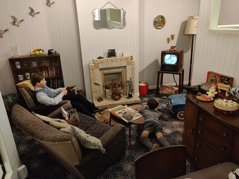
Photo: Tim Sheerman-Chase, CC BY 2.0, via Wikimedia Commons
A house should feel like a conversation, not a chorus line
There is a particular kind of disappointment that comes from painting an entire house in one carefully chosen neutral. On paper it sounds calm, coherent and sensible. In reality, the north-facing back bedroom can look grey and slightly bruised while the south-facing landing glows like a Mediterranean afternoon. The same tin, doing different things in different rooms, is not a failure. It is just light being light.
A whole-house colour map is the antidote. It is not a rulebook that says every wall must match. It is a plan that gives each room its own voice while making sure the voices are singing from the same hymn sheet. For UK homes, where period proportions, narrow hallways and changeable daylight all pull in different directions, that plan is worth more than a stack of paint charts.
Start with the light, not the colour card
Before you fall for a shade on Instagram, walk around your house at three different times of day. Notice which rooms get direct sun, which ones rely on borrowed light and which ones never quite shake off the chill. North-facing rooms tend to cool colours down, so a warm neutral with a hint of yellow or pink can stop them feeling clinical. South-facing rooms can carry cooler greys and soft greens without turning gloomy.
Undertones matter more than the name on the tin. Two off-whites can look identical in the shop and completely different once they are up. A neutral with a green undertone may sit beautifully next to an olive sofa but clash with a red-brick chimney breast. A neutral with a pink undertone can warm up a dim hallway, but it can also make a cool grey carpet look slightly mauve. This is why sample pots are not a luxury. They are a small insurance policy.
Choose a lead neutral that can travel
The lead neutral is the colour that appears most often, usually in hallways, landings, ceilings and the rooms that need to recede. It does not have to be the same product everywhere. It might be a warmer version in the hall and a slightly cooler version in a kitchen extension. What matters is that the undertone stays in the same family.
In a Victorian terrace, the hallway is often the hardest-working space and the one that sets expectations. A soft stone or warm off-white on the walls, with a deeper version on the stair spindles or below the dado, gives the eye somewhere to land. In a 1930s semi, where rooms often lead off a compact central hall, keeping the hallway light and low-contrast helps the whole house feel less segmented.
Use accents as punctuation, not paragraphs
Accent colours are where the character lives. A deep teal in a dining room, a muted terracotta in a snug, a soft sage in a bedroom: these are the rooms that make a house feel remembered. The trick is to repeat each accent at least once elsewhere, even in a small way. A teal cushion in the hallway, a terracotta blind in the kitchen, a sage trim in the study. That repetition is what makes the scheme feel intentional rather than accidental.
If you are nervous about strong colour, put it where you will not tire of it. Inside a bookcase, below a dado rail, on the back of a door, or on a single chimney breast. These are low-commitment places that still give a room a point of view.
Let sightlines do the planning
Stand in the doorway of each room and look through to the next. In open-plan layouts, this matters even more. You might see the kitchen, the dining area and the garden all at once, so the colours need to relate without competing. A useful approach is to choose one lead neutral for the largest surfaces, one mid-tone for joinery or a feature wall, and one accent that appears in textiles and smaller painted details.
In closed-plan period homes, the hallway sightline is the one to protect. If every room off the hall is a different bold colour, the view from the front door can feel choppy. A consistent trim colour, often a soft white or off-white, can act like a frame around each room and settle the whole scheme down.
Finish transitions should be quiet
Sheen is part of the colour map. A wall in matt emulsion and the same shade in eggshell will not look identical, especially on uneven plaster. In older homes, a lower sheen on walls is usually more forgiving, while eggshell or satin on woodwork gives practical wipeability. The transition between finishes should feel deliberate, not accidental. If you are changing from matt to eggshell on the same colour, test a patch first. The contrast can be stronger than expected.
Practical steps before you call the decorator
Start by collecting one sample pot of your lead neutral and one of each accent. Paint A4-sized patches on lining paper and move them around the room for a week. Look at them at breakfast, at dusk and under the ceiling light. Note the direction your main windows face and whether the room is used mostly in the morning or evening.
Next, write a simple room-by-room list: walls, ceilings, woodwork, radiators and any feature areas. Keep the list on your phone so you can refer to it in the paint shop. If you are working with RG Painters & Decorators, this list helps us quote accurately and spot the awkward bits early, from sloping ceilings to old gloss that needs keying back.
Finally, decide where you are willing to be brave and where you need calm. A whole-house palette works best when it has both. The goal is not to make every room look the same. It is to make every room feel like it belongs.