Where the Wall Changes Its Mind: Two-Tone Paint for Rooms With Awkward Proportions
Two-tone walls have a way of looking effortless in photographs. A crisp line, a darker lower half, a lighter upper half, and suddenly the room seems more considered. In practice, that line is doing a lot of quiet work. It can correct a room that feels too low, too narrow or just oddly shaped — or it can draw attention to every socket, radiator and lumpy bit of plaster you were hoping to ignore.
The trick is not simply choosing two nice colours. It is deciding what the horizontal divide is for, where it should sit, and whether your room is actually a good candidate for it. In British homes, where ceiling heights, window sizes and wall conditions vary wildly from Victorian terraces to new-build flats, that decision deserves a proper look before the tape goes up.
Why a horizontal line changes how a room reads
A painted horizontal band gives the eye something to follow. It can break up a tall, empty wall, add weight to a room that feels insubstantial, or create the impression that a wall is wider than it really is. Because the line runs across the room rather than up and down it, it tends to emphasise breadth rather than height.
That is why two-tone schemes are often suggested for narrow rooms. A darker lower section, with a lighter colour above, can make the lower half feel grounded while the upper half recedes. In a low-ceilinged room, the opposite approach can help: keep the upper wall close to the ceiling colour so the eye travels upward without a hard stop, and use the darker tone below to bring the room down to a comfortable human scale.
It is not a magic trick. The effect depends on the colours, the light and the height of the divide. But when it is done with a bit of thought, a horizontal break can make an awkward room feel deliberate rather than wonky.
Picking the height: dado, picture rail or somewhere in between
In older British homes, the obvious heights are already there. A dado rail usually sits around 90cm to 1.1m from the floor, while a picture rail tends to run closer to 1.5m to 1.8m. If your room still has either, using the existing moulding as the colour change is often the most natural solution. It looks intentional because it follows the architecture rather than fighting it.
Not every room has that luxury. In a modern flat or a room where the rails have long gone, you can choose a bespoke height. A lower divide — around waist height — tends to feel intimate and grounded. A higher divide, nearer picture-rail level, can make a room feel more formal and can help if you want to keep the upper wall light and airy. Just be careful with very low ceilings: a high band can create a visual ceiling of its own, making the room feel compressed.
It also helps to stand in the doorway and look at the room from the angle you actually use it. A line that looks perfect from one spot can feel off from another, especially in rooms with sloped ceilings or deep chimney breasts. Masking tape is your friend here. Put it up, live with it for a day, and adjust before any paint is opened.
Pairing colours for British light
UK light is not a single thing. A south-facing room can carry stronger colours than a north-facing one, and a room with small windows will always make a dark lower half look darker than it did on the colour card. That does not mean you have to play it safe, but it does mean the pair needs to be tested in the room, not just in the shop.
A useful starting point is to keep a clear relationship between the two colours. Either choose a lighter and darker version of the same hue, or pair a warm neutral below with a cooler neutral above. Strong contrasts can look fantastic, but they also make the horizontal line more prominent. If the room has plenty of architectural interest, that can work. If it is a plain box with a radiator and a door, a softer contrast is often easier to live with.
Finish matters too. A durable mid-sheen or eggshell on the lower half is practical for hallways, kitchens and family rooms, while a washable matt above keeps things calm. Just remember that different sheens can change how a colour reads, so test them together rather than assuming the same shade will match across finishes.
The fittings problem: skirting, radiators and sockets
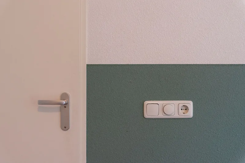
This is where two-tone schemes often come unstuck. A horizontal line has to negotiate skirting boards, radiators, sockets, switches and any built-in joinery. If the line sits at dado height, it may cut straight through a radiator or leave a row of sockets stranded in the wrong colour zone. That is not a disaster, but it needs a plan.
One option is to paint the lower section and the skirting in the same colour, so the base of the room reads as one solid block. Another is to keep the skirting in a contrasting white or off-white, which gives a crisper, more traditional look. Radiators can be painted to match the wall behind them, which helps them disappear, or treated as a feature in the lower colour. Sockets are trickier. If they fall close to the line, it is often better to move the line slightly than to create a fiddly patch of colour around each plate.
In rooms with lots of pipework or uneven walls, a horizontal divide can also highlight imperfections. Paint with a matt finish is more forgiving than a sheen, and good preparation matters more than ever. If the wall is lumpy, the line will be lumpy too unless it is filled and sanded properly first.
When two-tone will make life harder
A horizontal split is not the right answer for every awkward room. If the room is already busy — deep cornices, picture rails, dado rails, patterned wallpaper, lots of doors and radiators — adding another strong horizontal line can make it feel chopped up. In small rooms with low ceilings and limited light, a single colour carried through walls and ceiling is often calmer and more effective.
It is also worth being honest about maintenance. A dark lower half in a hallway will show scuffs and marks more readily than a mid-tone, and a crisp horizontal line can be difficult to touch in neatly later. If you are the sort of household where bikes, buggies and football boots come through the door, a simpler scheme may be the kinder choice.
A calm way to test it before committing
Before you commit to a two-tone room, try a sample patch at the actual split height. Paint a section of wall about a metre wide, let it dry, and look at it in morning, afternoon and evening light. Check how it sits against the skirting, the radiator and the door frame. If the line feels like it is cutting the room in half rather than giving it a useful proportion, adjust the height by 10cm or 15cm and try again.
Two-tone walls can be a smart, practical way to work with a room that fights its own proportions. They are less about following a trend and more about giving the eye a comfortable place to rest. Get the height and the colours right, plan for the fittings, and the result can feel as though the room was always meant to be that way.