The Fixed Points: Kitchen Wall Paint When the Units Stay Put
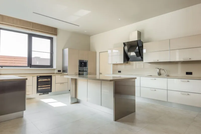
Kitchen projects have a habit of growing. You start with a simple idea about freshening up the walls and somehow end up with quotes for new carcasses, a different worktop and a splashback you had never planned to notice. But plenty of UK kitchens do not need that level of upheaval. If the units are sound, the worktop is still doing its job and the tiles are more 'of their time' than 'past their sell-by date', wall colour is often the least expensive way to make the whole room feel considered again.
The catch is that a kitchen is not an empty box. It is a room full of fixed points: cabinet fronts, work surfaces, tiles, flooring, window frames and the colour of the light coming through the glass. Paint has to live alongside all of it. Choose well and the room looks as though someone made a decision. Choose badly and even a good colour can make the cabinets look tired, the worktop look yellow or the tiles look as if they belong to a different house.
Start with a fixed-finish audit
Before looking at colour cards, take a slow walk around the kitchen with a notebook. Write down what is already there and, more importantly, what undertone each element carries. A white worktop might be cool and grey-edged, or warm and creamy. Cabinet fronts might be a true white, an off-white with a green hint, or a wood tone that shifts from honey to orange depending on the hour.
Look at the tiles too. Grout colour matters as much as the tile itself. A pale grey grout can calm a busy pattern; a yellowed grout can make the whole wall feel older than it is. Note the floor as well, because it is the largest fixed surface in the room and often the one people forget. If the floor is warm oak, colours with a cool blue base can feel disconnected. If the floor is grey tile, very yellow-based creams can clash.
This audit is not about finding a perfect match. It is about understanding the room's existing palette so you can choose a wall colour that supports it instead of arguing with it.
Match the undertone, not the exact shade
A common mistake is trying to match the wall colour exactly to the cabinets or worktop. Exact matches rarely work because different surfaces reflect light differently. A cabinet door may be satin and reflective; a wall is usually matt and absorbent. The same colour can look lighter on one and heavier on the other.
Instead, choose a wall colour that shares an undertone or deliberately contrasts in a controlled way. If the cabinets are a soft green-grey, a wall in a warmer off-white with a hint of stone can stop the room feeling cold. If the cabinets are pure white and the worktop is cool grey, a pale plaster or mushroom tone can soften the edges without turning the kitchen beige. If the cabinets are dark navy or charcoal, lighter walls can make the units feel intentional rather than heavy.
The safest approach for most UK kitchens is a wall colour that sits slightly apart from the cabinets rather than competing with them. You want the eye to move around the room comfortably, not stop dead at the join between wall and cabinet.
Test the colour in three lights
Kitchen lighting is rarely generous. Many rooms have a mix of natural light from one window, a central ceiling light, under-cabinet strips and perhaps a pendant over a table. A colour that looks fresh at 10am can look grey at 4pm and almost green under a warm LED.
Paint large samples onto offcuts of lining paper or directly onto the wall in at least two places: one near the window and one in the darkest corner. Leave them for a full day and look at them in the morning, late afternoon and with the kitchen lights on. This is especially important in north-facing kitchens, where cool colours can turn chilly, and in small kitchens where light bounces off worktops and tiles.
If you are keeping the tiles, hold the sample next to the grout line as well as the tile face. Grout is often the detail that makes a colour feel wrong.
Choose a finish that can take kitchen life
Kitchen walls do not get an easy ride. Steam, cooking oil, splashes from the sink and the occasional enthusiastic tomato sauce incident all end up on the paint. A standard matt emulsion may look lovely on day one, but it can mark easily and clean poorly.
For most kitchen walls, a washable or scrubbable matt emulsion is a sensible middle ground. It keeps the flat, modern look many people want while offering more resistance to wiping. In splash zones and around the sink, a water-based eggshell or a dedicated kitchen and bathroom paint can be more practical, though it will have a slight sheen. The key is to read the tin: 'washable' and 'scrubbable' are not the same thing, and some finishes need a few days to cure before you wipe them down.
Preparation matters as much as the product. Grease is the enemy of adhesion, so degrease walls properly before painting, especially behind the hob. Do not paint over damp or mould without fixing the cause first.
Work with the gaps, not against them
In a kitchen that is staying put, the spaces between cabinets, around the window and above the worktop are part of the design. A darker colour on a narrow chimney breast can make it feel deliberate. A lighter colour on the wall behind open shelving can help the shelves read as a feature rather than clutter. If the cabinets stop short of the ceiling, painting the wall above them in a similar tone to the ceiling can make the room feel taller; a contrasting colour can make the cabinets look more grounded.
None of this requires new units. It requires a little observation, a few sample pots and a willingness to let the fixed finishes have a say. The result is a kitchen that feels refreshed rather than half-finished, and walls that work with what is already there.