First Impressions Start at the Door: Rethinking Hallway Colour in British Homes
Magnolia is not the villain of the British hallway. It is simply the default, and defaults have a way of making a room feel unfinished. The hallway is where you drop your keys, wrestle off a wet coat and decide whether the rest of the house is going to behave. It deserves a proper colour decision, not a leftover tin from the last bedroom refresh.
The hallway is a room, not a corridor
We ask a lot of hallways. They have to store shoes, survive school bags, hide the boiler and make a good impression on the takeaway delivery driver. Yet they are often painted as though they are merely a passage between more important spaces. That is the wrong way round. The hallway is the first thing you see when you come home and the last thing you see when you leave. It sets the mood before anyone reaches the kitchen.
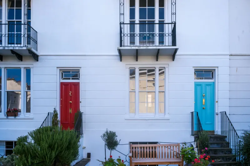
A stronger colour here is not about being loud for the sake of it. It is about giving the space a point of view. A deep green, a warm clay, a confident blue or a soft charcoal can make a narrow hall feel intentional rather than accidental. It can also flatter the woodwork, the stairs and the front door far better than another coat of barely-there cream.
Why magnolia became the default
Magnolia is safe. It is light, neutral and unlikely to offend a future buyer. For landlords and quick turnarounds, that makes sense. But safe can also read as unfinished, especially in a hallway where there is no view, no soft furnishing and very little natural light. The result is a space that feels like it is waiting for someone to make a decision.
The alternative is not necessarily a dark and dramatic entrance. It is a colour that has been chosen rather than inherited. Even a warmer off-white, a pale stone or a muted sage is a decision. The difference is that it looks deliberate.
The small-and-dark fear
This is the objection we hear most often: the hallway is small, so it must be painted pale. Sometimes that is true. But small and pale does not automatically equal bright, and small and dark does not automatically equal gloomy. What matters is how the colour behaves with the light you actually have.
Dark colours can blur the edges of a narrow hallway, making the space feel more enveloping and less like a tunnel. Mid-tones can add depth without swallowing the light. A colour-drenched approach, where walls, woodwork and even the ceiling are painted in related tones, can make a hallway feel more coherent and, counterintuitively, more spacious than a patchwork of contrasting colours. The trick is to test the shade in the hallway itself, at different times of day, rather than judging it on a colour card in a bright shop.
Finishes that survive real life
Hallways are high-traffic rooms. Wet coats, muddy shoes, bike handlebars and the occasional enthusiastic dog all leave their mark. A durable washable matt or a low-sheen eggshell is usually a better bet than a delicate flat matt. Eggshell is wipeable and hard-wearing, though it can show imperfections in the plaster, so preparation still matters. If the walls are less than perfect, a durable matt can be more forgiving.
Woodwork needs a finish that can take knocks. Stair spindles, dado rails and skirting boards are prime targets for scuffs, so a hard-wearing satin or eggshell is sensible. If you have picture rails, consider painting them in the same colour as the walls for a calmer look, or use them as a deliberate horizontal line between two related shades.
Palettes that suit British architecture
Victorian and Edwardian hallways
These houses often have generous proportions, decorative cornices and a long sightline to the stairs. Deep olive or forest green with a warm chalky white on the ceiling can look handsome and grounded. An inky blue with limestone white and natural brass fittings is another strong option. If there is original tiling, let it guide the palette rather than fighting it.
1930s semis
A sage green with a soft cream and black iron details feels period-appropriate without being slavish. Clay or terracotta can work well if the hallway is warm and gets some afternoon light. Keep the ceiling light and the woodwork simple so the colour has room to breathe.
New-build hallways
New builds often have narrow halls and very neutral finishes. A charcoal wall with a pale blush or warm off-white can add depth without making the space feel closed in. If the hallway has no window, keep the ceiling and floor tones light and use colour on the walls to create a sense of arrival.
Lighting is part of the colour
A hallway colour is never just a colour. It is a colour plus a bulb, a shadow, a stairwell and whatever light comes through the front door glass. Warm white lighting tends to flatter deeper colours, while cool white can make them look grey and flat. Test your shortlist under the actual lighting, both in the morning and at night. If the hallway is dark, layered light — a ceiling fitting, a wall light and perhaps a lamp on a console — will do more for the space than choosing the palest paint on the shelf.
A practical way to commit
Paint a sample board, not just a small patch, and move it around the hallway over a few days. Live with it next to the coat rack and the stair carpet. If you are nervous, start with a mid-tone rather than a near-black, or use a bold colour below the dado and a lighter tone above it. The goal is not to make the hallway look like a show home. It is to make it feel like the start of your home.
At RG Painters & Decorators, we like a hallway that says something before the living room has had a chance to speak. With the right colour and a finish that can take a bit of life, that first impression can last a lot longer than magnolia.