The Quiet Workhorses: Why Skirting, Doors and Architraves Deserve a Proper Colour Decision

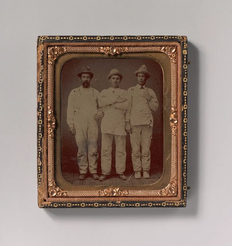
Photo: NPS Photo, Public domain, via Wikimedia Commons
Ask anyone midway through a decorating project what colour they've picked and they'll describe the walls. Skirting boards, doors and architraves usually get whatever is left in the tin, or a default brilliant white that nobody consciously chose. That's a shame, because the woodwork is doing an enormous amount of quiet work in every room it touches — and getting it right is often the difference between a room that feels finished and one that feels almost finished.
The trim is the frame around everything
Think about how you actually look at a room. You don't stare at a blank wall for long. Your eye travels: from the door you walked through, along the architrave, down to the skirting, across the floor, back up. The woodwork is a continuous outline drawn around the space, and like any frame it either suits the picture or fights it.
In a Victorian terrace with deep skirting and generous mouldings, that frame is a feature in its own right. In a new-build with slim, square-edged trim, it's a background detail. Same paint, very different job. Treating both the same way is how rooms end up feeling either underdressed or oddly heavy.
In defence of crisp white (and when it misfires)
White woodwork is the safe answer for good reason. It bounces light around north-facing rooms, keeps small box rooms from closing in, and reads as clean and traditional in period properties. It's also forgiving: if you repaint the walls in three years, the trim still works.
Where it goes wrong is in the shade. 'Brilliant white' on the skirting against an off-white or greige wall can look stark and slightly cheap — the contrast is too hard, and any yellowing or scuffing shows up instantly. A softer white, matched to the wall or a shade warmer, blends the edges and lets the wall colour do the talking. If you're working with a heritage palette, this matters even more; the wrong white can flatten a carefully chosen scheme.
A practical tip we give clients: hold a trim sample against the wall colour in daylight, not under the kitchen spotlights, and look at it from across the room. The relationship between the two, not the colour in isolation, is what you're judging.
Colour-drenching: when the woodwork joins in
Painting walls, skirting, architraves and even the door in the same colour has moved from trend to mainstream, and for good reason. In a small bedroom or a hallway with no natural light, drenching removes the visual stop-start of a white outline and makes the space feel bigger and calmer. Cornicing and ceiling in the same tone takes it further, though be prepared for the room to feel dramatically cocooning rather than airy.
A halfway house works well in UK homes: keep the walls light, then bring the woodwork down a few shades in the same family — a soft sage wall with a deeper olive skirting, say. It reads as intentional without committing you to a full drench. And in rooms with good original joinery, a deeper trim colour can make the mouldings look more expensive than they are.
Finish matters as much as colour
Eggshell has become the default for a reason: it's hard-wearing, low-sheen and doesn't spotlight every imperfection the way gloss does. Water-based eggshells have improved hugely, dry fast, stay whiter for longer and are far kinder to work with in a lived-in house.
Satin sits between eggshell and gloss — a touch more reflective, good for doors and frames that get handled constantly, and easier to wipe down. Traditional oil gloss still has its fans for front doors and exterior joinery, where its hardness and depth are hard to beat, but it yellows over time and needs more drying time than most households want to give it.
For hallways and children's rooms, we'd normally steer towards a mid-sheen water-based eggshell or satin. For a formal living room with ornate mouldings, a lower sheen keeps the detail readable rather than turning it into a series of highlights.
The mistakes that make a careful job look amateur
The colour decision is only half of it. These are the things we see most often when we're called in to put a previous job right:
- Two whites that don't agree. Ceiling white, wall white and trim white from three different ranges will clash. Pick one family and stick to it.
- Sloppy cutting in. A wobbly line where trim meets wall undoes hours of prep. Good taping and a steady hand cost nothing extra but change everything.
- Skipping the key. Painting over old gloss without sanding or a suitable undercoat leads to flaking within a season or two.
- Ignoring knots and stains. Untreated knots bleed through within months. Shellac-based primer is not optional on bare softwood.
- Forgetting the edges. The top of a door, the hinge side and the inside of the frame get missed surprisingly often — and they're the bits you see when the door is open.
- Painting over silicone. No paint sticks to silicone. Cut it out and redo it properly.
Before the brush comes out
Spend twenty minutes with your trim samples and your wall colour before you buy anything. Decide whether you want the woodwork to disappear into the room or quietly outline it. Then choose a finish that suits the traffic the surface gets, and budget the time for proper prep — sugar soap, filling, sanding, caulking, priming.
None of that is glamorous. But the skirting and doors are the parts of a room your hands actually touch, and the parts your eye follows every time you walk in. Give them a decision, not a leftover.