Where the Garden Meets the House: Colour Choices for Boundary Walls, Fences and Gates
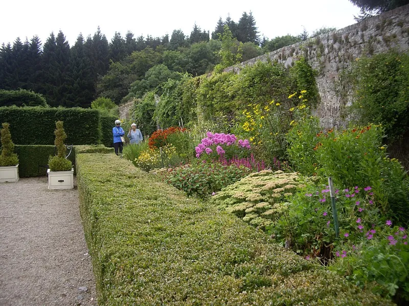
Photo: Stanley Howe , CC BY-SA 2.0, via Wikimedia Commons
A house does not really stop at its front door. The boundary wall, the fence down the side, the gate you swing open with one hand while juggling shopping — these are the surfaces that frame the place before anyone gets close to the brickwork. And yet they are often the last things to get a colour decision. The result is a home that looks beautifully considered up to the doorstep, then slightly accidental beyond it.
The good news is that boundaries are forgiving. They do not need to match the house exactly. They need to relate to it. Think of them as the supporting cast: quiet enough not to fight the leading role, strong enough to hold the composition together.
Start with the house, not the fence
The most common mistake is choosing a boundary colour in isolation. A deep charcoal fence can look excellent in a brochure, but if your house is pale render with soft stone lintels, it may read as a hard black line drawn around the garden. Equally, a pale sage gate can disappear against a hedge but look washed out beside warm red brick.
Before you look at a colour card, stand at the front of the house and note the fixed tones: brick, render, roof, window frames, mortar, stone cills, and the front door. The front door is especially useful. If it is a strong colour, the boundary can echo it at lower volume — perhaps a muted version on a gate, or a related tone on railings. If the door is quiet, the boundary does not need to become the loudest thing on the street.
Also notice undertones. Brick can be orange, plum or brown. Render can be creamy, grey or chalky. A fence painted in a green with a yellow base will feel different beside a cool grey render than a green with a blue base. This is not about being precious; it is about avoiding the moment when a new fence makes the house look slightly off-colour.
Masonry walls: let the wall stay a wall
Garden walls are usually brick, block, render or stone. They take a different kind of paint from timber, and they need to breathe. On older solid walls, a breathable masonry finish is important; trapping moisture under a heavy, non-breathable coating can lead to flaking, damp patches and a lot of head-scratching later. On rendered walls, check that the render is sound before painting. Filling cracks and treating mould is not glamorous, but it is the difference between a finish that lasts and one that starts lifting after the first wet winter.
Colour-wise, masonry boundaries often work best when they pick up something already present in the house. A warm off-white on a garden wall can tie in with window surrounds. A soft grey can sit comfortably beside slate or grey window frames. If the house is red brick, a wall painted in a related earthy tone can feel more intentional than a stark contrast. If you want contrast, choose it deliberately — a deep green wall beside pale render can look brilliant, but it will dominate, so keep the rest of the boundary simple.
Remember that masonry paint colours can shift outdoors. What looks like a soft grey on a small sample may look almost white in full sun, and a deep colour can look nearly black on a dull day. Always test on the actual wall.
Timber fences: colour is only half the job
Timber fences, gates and shed walls need a finish that can move with the wood and cope with British rain. Microporous wood stains and exterior paints allow moisture to escape while protecting the surface. That flexibility matters on feather-edge boards, closeboard panels and any timber that swells and shrinks through the seasons.
Preparation is where most fence jobs succeed or fail. New timber may need to weather before certain finishes are applied; old timber may need cleaning, sanding, treating for mould or algae, and repairing where boards have rotted at the base. Knots need attention, gaps need filling where appropriate, and the bottom rail — the part closest to wet ground — deserves a close look. A beautiful colour over failing timber is just a short-lived disguise.
For colour, the default brown is not the only option. A soft green-grey can settle a fence into a planted garden. A dark blue-grey can make a small garden feel more enclosed and elegant. A pale, chalky finish can lift a shady side return. But keep an eye on the house: a very warm orange-brown fence beside cool grey render can look disjointed, while a muddy green beside fresh white render can look tired. Test a patch at eye level and another near the ground, because light changes fast down a side passage.
Gates and railings: the punctuation marks
Gates and metal railings are small surfaces with a lot of visual weight. A gate is a repeated colour note every time you come home; railings draw lines across the front of a house. This is where a boundary can look sharp and intentional, or fussy and random.
Metal needs a different approach: rust removal, a suitable primer, and a topcoat designed for the job. If the railings are galvanised, check what the coating system is compatible with. For gates, pay attention to hinges, latches and the bottom edge, where water sits. A gate that sticks because paint has bridged the gaps is a daily annoyance.
Colour can be simple here. Black is classic for railings, but it is not compulsory. A dark green, deep bronze or charcoal can feel softer against brick and planting. On a timber gate, matching the fence is usually the calmest choice, but a slightly darker gate can add a useful focal point at the entrance. Just avoid making the gate a completely separate colour story unless you have a clear reason — it can make the boundary feel pieced together.
Weather, wear and the maintenance calendar
Exterior painting is not a one-off event. In the UK, a boundary takes wind, rain, frost and summer sun. Masonry may need cleaning and recoating every few years. Timber fences often need a fresh coat more regularly, especially on south-facing or exposed sides. Metal railings need touching in where chips appear. A five-minute check each spring and autumn will tell you more than any paint label.
For 2026, the sensible approach is to plan the boundary as part of the wider exterior rather than as a weekend afterthought. Clear the surfaces, fix the failing bits, choose a colour that relates to the house, and use finishes made for the material and the weather. Then the wall, fence and gate stop looking like boundaries and start looking like part of the home.