The Ground Rules: Wall Paint That Agrees With the Floor You Already Have
Most decorating projects start with a fan deck and a wall. The floor barely gets a look-in. It is already there, already paid for, and usually staying put. Yet in most UK homes the floor covers more uninterrupted colour than any wall, and it sits right next to every sample you tape up. Ignore it and even a beautifully chosen wall colour can feel slightly wrong — muddy, cold, or oddly loud — without anyone being able to say why.
The largest fixed colour in the room
A carpet, a run of engineered oak or a Victorian tiled hallway is not a neutral backdrop. It has an undertone, a value and a texture, and all three influence how the wall colour above it reads. Light bounces off the floor and washes up the wall; dark floors soak up light, pale floors push it around. Two rooms painted the same colour can look entirely different depending on what is underfoot. That is why testing paint on a bare patch of plaster tells you only half the story.
Read the floor before you open the fan deck
Start by working out what your floor is doing. Take a carpet offcut, a spare tile or a good photograph of the boards into daylight and compare it with a sheet of white paper. Does it lean warm — red, yellow, orange — or cool — blue, green, grey? Is it light, mid or dark? Grout counts too: wide pale grout can cool a terracotta floor, while dark grout makes the same tiles look richer. Once you know the direction of travel, choosing wall colours becomes a process of agreement rather than guesswork.
Grey carpet: the cool customer
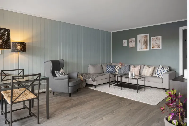
Grey carpet is the default in a lot of new-builds, rentals and 1930s semis that have been smartened up. It is also quietly opinionated. A cool blue-grey carpet can make a warm cream wall look yellow, and a pink-based grey can clash with lilac. Safer directions are greige, soft sage, muted blue-grey and off-whites with a touch of warmth. If the carpet is very cool, avoid stark brilliant white; it can make the floor look flatter and colder than it is. A mid-tone wall often bridges the gap more gracefully.
Oak, engineered wood and the warm-floor problem
Oak boards and engineered timber are lovely, but they are rarely neutral. Golden oak throws out a lot of yellow-orange, and buttery cream walls turn that volume up. Colours with a green or grey edge — sage, stone, clay, soft taupe — calm the floor down. Deeper shades such as olive, ink or charcoal look smart and grounded against timber. Approach honeyed creams, terracotta and strong yellows with care unless you want a very warm, almost golden room. Grey-washed or smoked boards are cooler, so they can take a softer grey-green wall without turning chilly.
Terracotta, quarry tiles and patterned Victorian floors
A terracotta kitchen floor or a hallway of encaustic tiles is a character in its own right. Trying to neutralise it with cool grey usually backfires; the tiles end up looking dusty and the walls look apologetic. Work with the floor instead. Off-white, olive, deep green, ink blue and plaster pink all sit comfortably alongside red and orange tones. Keep the palette limited and let the pattern do the talking. In smaller hallways, a lighter wall above a dark or patterned floor stops the space feeling top-heavy.
Pale carpets and the beige-on-beige trap
Cream and beige carpets are forgiving but easy to make dull. The classic mistake is a wall in a similar depth and tone, which leaves the room with no edges. You need contrast in value rather than a fight in hue: a mid-tone green, denim blue, mushroom or soft charcoal gives the eye something to hold on to. Avoid yellow-toned creams next to pink-beige carpet, which can make both look slightly grubby. If you want to stay neutral, go lighter or darker than the carpet, not level with it.
Dark floors and small rooms
Dark wood, slate and dark laminate absorb light, so walls often need to work harder. Warm off-whites, pale clay and soft stone reflect light without feeling clinical. Brilliant white can be too sharp against a very dark floor, and icy blues can make a north-facing room feel colder than it already is. Keep the ceiling lighter than the walls and avoid going too dark on every surface in a small room, unless you are deliberately creating a cocoon.
The sample test that actually tells you the truth
Paint a large board — A2 is ideal — with two coats and leave it to dry. Place it vertically at the junction of wall and floor, where the two colours actually meet. Live with it for a few days. Look at it at 8am, at noon and at 7pm, then again with the room lit as you normally use it. Move the board around the room and view it from the doorway. Compare it with a cushion, a curtain or a piece of furniture that is staying. A patch on the wall above a radiator tells you almost nothing.
A quick palette map
| Floor | Often works | Approach with care |
|---|---|---|
| Cool grey carpet | Greige, sage, blue-grey, warm off-white | Stark white, yellow-cream |
| Golden oak | Sage, stone, olive, ink, soft taupe | Honey cream, strong terracotta |
| Terracotta or quarry tiles | Off-white, olive, deep green, ink blue, plaster pink | Cool grey, lilac |
| Cream or beige carpet | Mid-green, denim, mushroom, soft charcoal | Similar beige, yellow cream |
| Dark wood or slate | Warm off-white, pale clay, stone | Brilliant white, icy blue |
Bridging the gap
If the floor and the wall still disagree, let something else mediate. A rug, a sofa, curtains or a run of cushions can repeat the floor colour and give the wall something to relate to. Choosing a mid-tone wall is another form of diplomacy: it sits between a pale floor and a dark one without demanding attention. And if the floor is genuinely past its best, a good clean and a fresh grout can change its undertone enough to make the paint decision easier.
The floor was there before the paint chart and it will be there afterwards. Treat it as part of the scheme rather than an obstacle, and the room will feel resolved in a way that a wall-only makeover rarely manages. If you would like a second pair of eyes before you commit, our team at RG Painters & Decorators is always happy to look at samples alongside the floor that is staying.