Look Up: Giving Your Ceiling a Colour Decision of Its Own
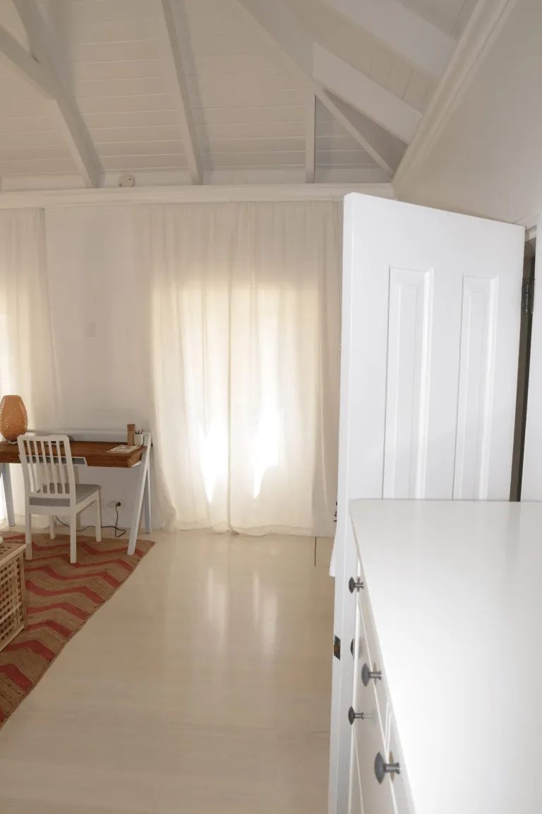
Photo: Federal Bureau of Investigation, Public domain, via Wikimedia Commons
Most rooms get a makeover in a familiar order. Walls first, woodwork second, and the ceiling only when a crack, a water mark or a cobweb forces the issue. Yet the ceiling is the largest uninterrupted surface in the room. It bounces daylight back into the space, picks up every lamp, and quietly decides whether a room feels generous or slightly pressed down. In British homes, where ceilings are often lower than we would like and winter light can be thin, that decision deserves more than a hurried coat of brilliant white.
Why the ceiling reads first, even when nobody looks
A ceiling is never really neutral. Even a basic white reflects the colour of the walls, the floor and the furniture back into the room. In a north-facing sitting room with cool daylight, a stark blue-white ceiling can make the whole space feel chilly. In a warm, south-facing kitchen, the same white may look clean and crisp. Change the ceiling and you change the atmosphere, often without being able to say exactly why.
Height matters too. A pale ceiling can lift a low Victorian terrace room, while a deeper tone can make a tall Edwardian space feel more intimate. The trick is not to treat the ceiling as a separate project. It is part of the same colour story as the walls, the woodwork and the light coming through the window.
White is not one colour
Choosing a ceiling white is like choosing a wall colour, except the differences are subtler and the consequences are spread across the whole room. A clean, bright white can sharpen a modern new-build, but in an older property it may look harsh against aged plaster and warm timber. A soft off-white with a hint of stone or linen tends to be more forgiving. A chalky white can work beautifully in period rooms where the walls are already muted.
It helps to compare the ceiling white with the woodwork. If the skirting and door frames are a crisp white, a warmer ceiling can create a gentle contrast rather than a mismatch. If the walls are a soft green or a clay pink, a ceiling with a barely-there warm undertone will often sit more comfortably than a cold brilliant white. The aim is not to match everything. It is to avoid a ceiling that looks like it belongs to a different house.
When to go beyond white
There is a place for colour overhead. In a dining room with good ceiling height, a soft sage, a dusty blue or a pale putty can make the room feel cocooning without closing it in. In a period home, a deeper ceiling colour can make cornices and ceiling roses stand out, especially if the walls are kept lighter. The effect is less about drama and more about depth.
Low ceilings need more care. A dark ceiling in a small box room can feel deliberate and cosy, but it can also feel heavy if the room lacks daylight. If you want to try it, keep the walls light and use the ceiling colour as a quiet wrap rather than a statement. In bathrooms and small cloakrooms, a mid-tone ceiling can hide imperfections better than a bright white, which tends to highlight every lump and hairline crack.
Finishes: matt, wipeable and the odd exception
Most ceilings are painted in matt emulsion because it softens light and hides minor unevenness. That is still the sensible default for bedrooms, living rooms and hallways. In kitchens and bathrooms, a wipeable matt or low-sheen ceiling paint can be more practical, especially where steam and cooking grease are part of daily life. Avoid high gloss unless you are deliberately restoring a period detail or want a very specific look; on a large ceiling it can show every roller mark and imperfection.
Preparation matters as much as the tin. A stained ceiling may need a stain-blocking primer before the topcoat, particularly where old water marks or nicotine have left a shadow. Fresh plaster should be sealed with the right primer, and any flaking paint needs to be removed and sanded back before you think about colour. A ceiling is awkward to paint, so the fewer surprises underneath, the better.
Cornices, edges and the line between wall and ceiling
The junction between wall and ceiling is one of those details that separates a quick refresh from a proper job. In homes with cornices, the ceiling colour can either let the moulding disappear or pick it out. Painting the ceiling and cornice the same colour creates a soft, seamless edge. Using a slightly different tone on the cornice can highlight the detail, but it also creates a stronger visual line, which may not suit every room.
In period properties, it is worth resisting the urge to paint over ornate plasterwork with thick, quick-drying paint. A crisp cutting-in line and a finish that respects the moulding will always look better than a heavy covering. In modern homes, a clean line between wall and ceiling is still the goal, even if the detail is simpler.
Lighting changes everything
A ceiling colour that looks perfect at midday can look grey at 7pm and slightly yellow under a warm bulb. Before committing, test the colour in the room where it will live. Paint two or three A3 boards with two coats and tape them to different parts of the ceiling, ideally near a window and in a darker corner. Check them in the morning, in the afternoon and with the room lights on. Then compare them with the wall colour and the woodwork.
Do not test with a tiny dab. A small patch is almost meaningless on a ceiling because the surrounding colour influences it so strongly. A larger board gives you a fair idea of how the shade behaves across a surface. If the board looks too cold, too creamy or too heavy, try the next option before the ladder comes out.
A simple way to decide
Start with two or three candidates: a soft white, a warmer off-white and, if the room can take it, a gentle colour. Test them properly, live with them for a few days and notice how they look when the room is empty and when it is full of people. The right ceiling colour should not announce itself. It should make the walls look better, the light feel kinder and the room feel more complete.
If you are unsure, choose a soft white with a warm undertone and a matt finish. It is rarely the most exciting decision, but it is often the one that lets everything else in the room do its job. And if the room has period detail or good height, give yourself permission to look beyond white. The ceiling is not just the bit above the walls. It is part of the room.