When the Light Never Turns Golden: Choosing Colour for North- and East-Facing Rooms
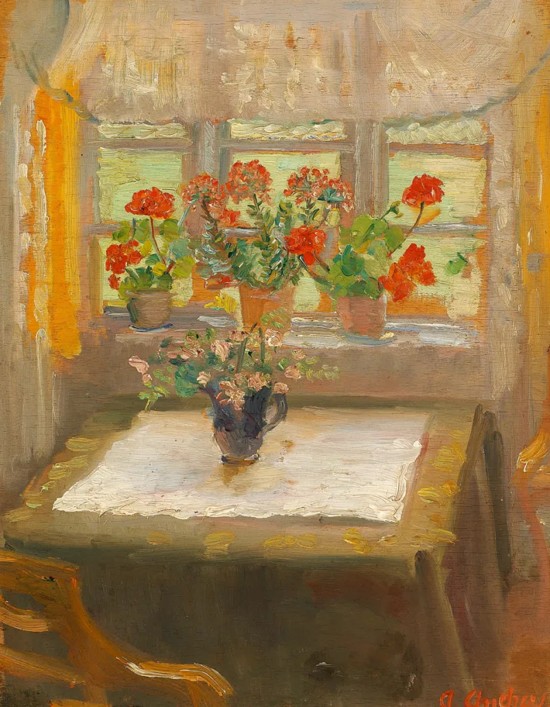
Photo: Anna Ancher, Public domain, via Wikimedia Commons
Walk into a south-facing sitting room in July and the paint seems to be doing half the work on its own. The light is warm, the shadows are soft, and almost any off-white looks like a considered choice. Walk into a north-facing room in November and the same tin can look like a different product altogether. This is not a trick of the mind, and it is certainly not a reason to give up and paint everything Brilliant White.
North light in the UK arrives without direct sun for most of the year. It is cool, diffused and faintly blue, and it does two things to a wall: it flattens contrast and it pushes the cooler undertones in a colour to the front. Yellows lose their glow, reds can go slightly muddy, and anything with a blue or green base suddenly looks much stronger than it did on the sample card. East-facing rooms are a separate case. They get a burst of bright, low light in the morning, then spend the afternoon in the same cool shadow as a north room. A colour has to survive both halves of that day.
Why the colour looked warmer in the shop
Retail lighting is designed to sell. Most paint shops run bright, high-output fittings at around 4000K with a high colour-rendering index, and samples are shown as small chips surrounded by white card. That combination lifts colours, adds warmth and hides the greyness that a real room will find. Add a north-facing window, a grey British sky and a pair of heavy curtains, and the gap between shop and hallway becomes obvious.
Small chips are also a poor test of area. A colour that reads as a soft neutral on a 5cm square can look like three different colours once it covers a whole wall, because large areas reflect light back into the room and change the apparent tone. Testing properly is the only reliable fix, and it is covered further down.
Undertones, without the jargon
Every colour has a base. The practical question in a north-facing room is whether that base sits warm (yellow, red, ochre, pink) or cool (blue, green, violet, grey). North light is cool, so warm-based colours hold their ground and cool-based colours drift towards the window. A warm off-white with a yellow or pink undertone reads as a soft cream rather than a chilly grey. A grey with a blue base will look almost lilac by February.
Light reflectance value matters too. Very pale colours bounce more light, but in a north room they often read as flat and slightly dirty rather than fresh, because there is not enough light to keep them bright. Mid-tone colours sit better: they hold their identity in low light and look richer in the evening under lamps. Deep colours can work beautifully in north-facing rooms, particularly in a dining room or snug used mostly after dark, but they need a lighting plan and they will look heavier on a dull Tuesday than they did on the sample.
Sheen: where the light actually lands
Finish has as much influence as colour. A dead matt absorbs light, which is exactly what you do not want in a room that is already short of it. A low-sheen washable matt or an eggshell gives the wall a slight surface that catches and spreads the available daylight, and it is far easier to clean in a hallway or kitchen. Full gloss on walls is best left to period details and hospital corridors.
The trade-off is that sheen highlights imperfection. A low-sheen finish on a wall with bad filling, picture hooks and a lumpy plaster patch will draw attention to every flaw. In older UK housing stock that means prep first, finish second.
Room by room
Living rooms. Warm mid-tone neutrals, clay, soft mushroom, muted olive with a yellow base. Avoid cool grey-greens and silver-greys unless you want the room to feel deliberately wintry.
Kitchens and diners. North-facing kitchens tend to feel clinical if the palette is too pale. A warm off-white on the units and a slightly deeper shade on the walls gives contrast without gloom. Eggshell on the walls for washability.
Bedrooms. East-facing bedrooms are bright at 6am and cool by 4pm. Mid-tone warm neutrals, muted rose or soft ochre hold up in both. Very pale yellows flare in the morning sun and then look tired.
Bathrooms. Often north-facing and often small. Warm white with a low-sheen moisture-resistant finish, and let tiles or fittings carry the colour. Stark grey makes a cold room colder.
Hallways and stairs. The classic north-facing corridor. A warm off-white on the walls with a deeper tone below the dado rail keeps it bright at eye level and practical at the bottom.
East-facing rooms: two colours in one day
East light is bright, low and slightly cool in the morning, then retreats into north-light shadow after lunch. Colours that work here are the ones with enough depth to avoid washing out in the morning glare and enough warmth to survive the afternoon. Test at 7am and again at 4pm, not just at midday. Pale blue-greys are the usual casualty: they look fresh at breakfast and distinctly grey by teatime.
Testing patches that actually tell you something
Paint two coats onto an A2-sized piece of lining paper or a spare plasterboard offcut, not directly onto the wall. Leave a white border. Move the board around the room through the day and look at it at 8am, noon, 4pm and again at 8pm with the lamps on. Check it against the curtains, the floor and the sofa, because a colour that works against a white sample card may fight a warm oak floor. Test in the season you are actually decorating in, and if you are painting in spring for a room you use mostly in winter, test again under the lamps you will really use.
Bulbs matter. A 2700K warm lamp will pull a colour towards yellow, while a 4000K bulb will make it cooler and closer to daylight. If the room has a mix, test with the mix.
The shortlist logic
Rather than a palette, use a filter. Warm undertone, mid light reflectance, low-sheen finish. That gives you warm off-whites, clay, soft stone, muted terracotta, olive and deep greens with a yellow base. Rule out blue-greys, cool whites and anything described as silver or ice. Then test three, not ten, and choose the one that looks least dramatic in the worst light of the day.
If the room still feels wrong after all that, it is usually the curtains, the floor or the lighting rather than the paint. A decorator with a colour consultation can save a lot of repainting, and it is cheaper than buying four more tins.